 There are many different attitudes and techniques to the restoring of paintings, many opinions as to how to restore without adding to a painting or giving an impression of union that may falsify the state of the painting on arrival, before restoration, the other term is of course, conservation, this rather indicates a less intrusive state of repair. The problems of mixing colours and assessing what is missing in areas can lead to arguments as to the restorers taking too many liberties with a painting, possibly worse when the skilled restorer can leave very little evidence of his/her work. One opinion to overcome this is the use of colour harmonising, the human eye as a natural tendency to fill in gaps and compensate for missing colours, in an extreme example it will provide colours if it is deprived.
Here is an abbreviated version from a book published around 1836, in Edinburgh for sale in the same city, it is to provide guidance to interior decorators and painters. The colour wheel is the starting point but it is later that we get an idea of how the modern restorer can use the eye of the viewer to paint the missing parts.
 Colour harmony-
there are three distinct primary colours, yellow, red and blue as there are three distinct notes in music, C, E and G, and seven distinct colours as there are seven notes for a complete scale.
If the colours are given numbers to show their values we will see that yellow = 3. Red = 5. Blue = 8 and when these colours are mixed together in these proportions, on an opaque body, the result is white, or white light, for the eye needs to compensate for each colour viewed with its opposite colour in the spectrum, giving rise to the colours being dismissed, appearing white. It is largely a reflective phenomenon that takes its results within the brain and not at the point of the colours mixing, similar to the way the brain can be made to cancel out sound with hearing other sound.
Secondary colours are then the mixture of the primary colours and therefore have joint values -
Orange has the value of 8. it is red(5) plus yellow(3).
Purple has the value of 13. it is red(5) plus blue(8).
Green has the value of 11. it is yellow(3) plus blue(8)
These colours are called accidental or contrasting colours and if they are then mixed with a primary they get a value of 16.
Orange(8) with blue(8) = 16. Purple(13) with yellow(3) = 16. Green(11) with red(5) = 16.
Tertiaries or thirds are a further mixing of the colours and are called neutral hues, if given a value of 32 they are termed neutral, having a neutralizing value, the most neutral being grey, black plus white.
Olive(24) comes from mixing purple(13) with green(11).
Citron(19) comes from mixing green(11) with orange(8).
Russet(19 comes from mixing orange(8) with purple(11).
The tertiaries give rise to other colours, such as brown, marron, slate - gradually arriving at their neutrality with the forming of black. One primary a harmony with two others, yellow will sit withorange on one side and green on the other, blue with the green and purple, the red with purple and orange.

Hue is a compound colour that is undiluted, primary colours cannot be hues because they change their name if another colour is added to them.
Tint is a gradation of colour in lightness, from the intense to white.
Shade is the gradation of colour or hue, in depth, from perfect to black.
To contrast, colours must bear relation to each otherin the power and point of tint, hue and shade, a tint of one colour,brought to an arrangement of contrast with another, must be equal in its diluteness, the same holding for colours receeding from their origional purity towards black; they are less powerful according to the dilution or shade.
Complementary colours - in pairs, yellow with violet, blue with orange, red with green, each pairing having the colours of red, blue or yellow in them, each pairing when mixed forming grey; so yellow plus violet gives grey, orange plus blue gives grey and red plus green gives grey.
AFTERIMAGES AND SUCCESSIVE CONTRAST
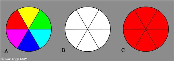
Figure 3.5. Afterimages and successive contrast. Stare fixedly at the centre of circle A for at least 20 seconds, then immediately look at the centre of circle B for about ten seconds, noting the changing afterimage. Each sector will display an afterimage the colour of the additive complement of the stimulus colour. Repeat the procedure, this time looking immediately at the centre of circle C. Now the colours of the afterimage in each sector will influence the appearance of the red colour in an example of successive contrast.A psycho-physical reality with the eye can be observed when viewing a colour, for instance green, for a period of time and then closing your eyes, on re opening them at a different image, it super imposes a red image and not the green that it had seen before, it is a phenomenon called contrast of succession, the eye presented with a colour demands its complementary and if denied, it will create the colour that it feels is missing. If one places within a pure colour, a grey square of exactly the same brightness, then this grey on a green background will become a grey with a red tinge, on red it will be grey shading to green, on violet it will be grey with some yellow and on yellow, it will be grey with a hint of lavender - 'the reality of a colour is not always the same as it's effect'.
It is possible to infill colour on a painting using this theory, the method can now be achieved with the use of cameras with colour filters and the use of computers to calculate the exact colour to fool the eye by combination of measure and intensity, it allows the restorer to apply colours, which on close inspection are not trying to copy the original, which the viewer will form an interpretation, thus avoiding any imitation of technique or falsifying the image.Several dramatic optical illusions demonstrate colour constancy in action. In the checkerboard illusion by Edward Adelson's (Figure 3.6A), the two squares marked A and B are actually identical in lightness on the image, but our visual system calculates that in a shadow area this grey must belong to a white surface, while in the lit area the same grey must belong to a dark surface, and that is how we see them. In the same way, in the cube illusion by R. Beau Lotto (Figure 3.6B), our visual system sees the same image colour as being dark brown in the context of strong lighting, and light orange where the same image colour appears in a deeply shaded context. In the cross-piece illusion , also by Lotto (Figure 3.6C), the colour at the intersection of the two rods is actually an identical colour (grey) in both cases, but in the context of apparently yellow illumination on the left and blue illumination on the right, this is judged, and seen, to be the reflectance of a blue-grey object and a yellow object respectively.
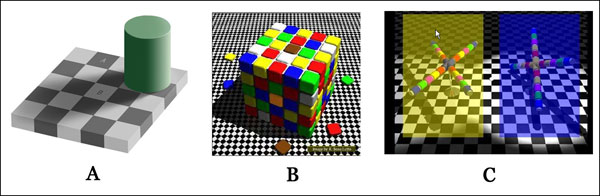
Figure 3.6. Three o


Nenhum comentário:
Postar um comentário